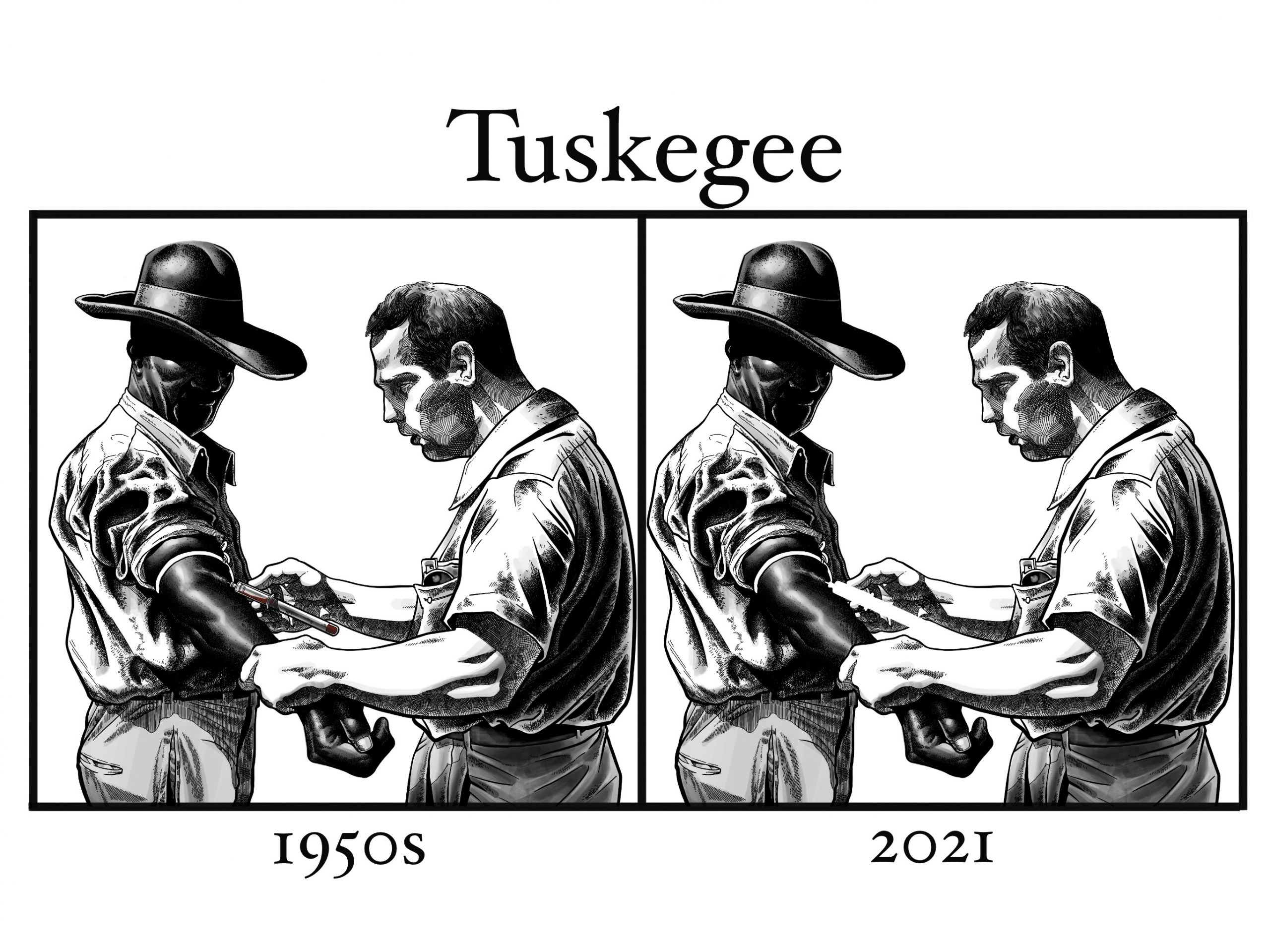
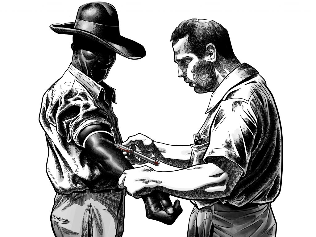
The left panel, labeled 1950s, represents the infamous study itself, where over 600 Black men, primarily sharecroppers, were recruited under the auspices of free medical treatment for “bad blood,” a term commonly used at the time to describe a host of different ailments. Instead, two-thirds of the test subjects with active syphilitic infections were observed and left untreated as their disease progressed towards sexual dysfunction, neurological deficits, and death – even after the antibiotic cure for the sexually transmitted infection became known in 1947. This illustration depicts a member of the
U.S. Public Health Service drawing blood from a Black participant in the study. The right panel, labeled 2021, is the exact same image, with the needle and collection tube erased from the illustration. The cartoon was meant to be some ostensibly clever examination of the abuse of the American Medical establishment on African Americans in the early 20th century by withholding syphilis treatment, and how this mistreatment persists in 2021 with the racial disparity in COVID-19 vaccine administrations in this same county in Alabama. The problem is that this image is conceptually flawed, and at this stage of the pandemic, intellectually dishonest.
The cartoon’s symbolism is muddy and doesn’t work for a few different reasons. The image on the left supposedly represents untreated syphilis, but seeing blood being collected by the U.S. Public Health Service falsely suggests this man was actually receiving healthcare. The image on the right supposedly represents a dearth of COVID-19 vaccinations, but vaccines are not administered intravenously, and certainly not via a blood collection tube. The panel on the right is also unsuccessful visually – you’d hardly notice the missing needle without me pointing it out. But the biggest issue with the cartoon is that it is factually inaccurate.
So at this point, I’d like to level set, and present the drawing on its own.